Sass Lighting
Choosing the right bulb begins with a simple question: What is the difference between warm white and cool white bulbs? The answer involves color temperature, mood, visibility, and room function. Warm white bulbs usually range from 2,700K to 3,000K. They produce a soft, yellow glow, similar to candlelight or an evening lamp. Cool white bulbs often range from 3,500K to 5,000K. Their light appears cleaner, brighter, and slightly bluish.
Lighting designer Randall Whitehead explains, “Warm light is more flattering to skin tones and creates a more inviting atmosphere.” This practical observation matters in living rooms, bedrooms, restaurants, and hospitality spaces. A warm bulb can make a wooden table feel richer and a quiet corner feel more comfortable. Cool white light can support task-focused areas, including kitchens, garages, offices, and bathroom mirrors. It may reveal details more clearly on a white countertop.
The choice is not always clean. A 4,000K bulb might feel balanced in one kitchen, yet harsh in another. Wall color, ceiling height, shade material, and daylight can change the result. Brightness matters too. A warm bulb with excessive lumens may still feel uncomfortable. A cool bulb with poor color rendering may make food and fabrics look dull. That is easy to overlook.
This guide examines both options through practical examples, measurable specifications, and room-by-room advice. It also questions the common belief that warm light always feels better. Sometimes, it does not. Your routine, eyesight, and personal comfort deserve equal attention.
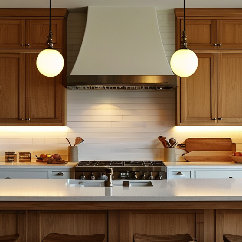
Understanding color temperature makes bulb selection more practical. Correlated color temperature, or CCT, is measured in kelvins. ANSI C78.377-2017 places common warm-white lighting near 2700–3000K. It places cool-white lighting near 3500–4100K. Higher values appear bluer and resemble overcast daylight. Lower values look softer, like an evening lamp.
In real rooms, warm white suits bedrooms, dining areas, and wood surfaces. I find 2700K more comfortable when reading late at night. Cool white can sharpen the appearance of tiles, white walls, and workbenches. The Illuminating Engineering Society notes that visual comfort also depends on glare, brightness, and surface reflectance. Color temperature alone is not enough. That is an easy mistake.
The U.S. Department of Energy’s 2023 solid-state lighting analysis treats efficacy, color quality, and controllability as major lighting-performance factors. Check the bulb’s lumens before judging brightness. A 4000K bulb is not automatically brighter than a 2700K bulb. Also inspect the color-rendering index, or CRI. A CRI of 80 is common, while 90 or higher can reveal skin tones and food colors more naturally. The International Energy Agency reports that LED adoption continues to improve lighting efficiency worldwide, but efficient lighting can still feel wrong when its color temperature clashes with the room. I sometimes choose 3000K in living spaces, though a slightly cooler 3500K may work better beside pale walls. Personal testing matters.
Warm white bulbs, usually around 2700K to 3000K, create a relaxed and familiar mood. Their amber tone softens wood, skin, and textured fabrics. I often use them in bedrooms, lounges, and dining areas after sunset. Faces can look gentler under this light. A small surprise.
Cool white bulbs, commonly 4000K to 5000K, produce a cleaner and more alert atmosphere. They can make white surfaces appear sharper and help reveal details on desks, counters, and workbenches. However, cool light may feel harsh in a quiet bedroom. It can also make pale walls look slightly blue, especially beside a window. Brightness is measured in lumens, not color temperature. A high-lumen warm bulb can be brighter than a low-lumen cool bulb.
Visual results also depend on shade design, wall color, and bulb placement. A frosted shade spreads light smoothly, while a clear bulb creates stronger highlights and shadows. In my own room, warm light looked comfortable but made printed text harder to read. I changed the task lamp instead of replacing every bulb. That solution was more practical, though not perfectly consistent. Color rendering matters too. A bulb with a high CRI can show food, clothing, and artwork more accurately, even when its color temperature stays warm. Test one bulb at night before changing the whole space.
Color temperature is measured in kelvins (K). Warm white light around 2700 K produces a yellowish, relaxing appearance and is commonly used in bedrooms and living areas. Neutral white around 4000 K appears cleaner and balanced for kitchens, offices, and workspaces. Cool white around 6500 K looks bluish and crisp, which can increase visual contrast and support detail-oriented tasks. Actual brightness is determined primarily by lumens, not color temperature.
Warm white bulbs, usually 2200K to 3000K, create a soft and welcoming atmosphere. They suit bedrooms, living rooms, and dining areas. Their amber tone makes wood, beige fabrics, and skin appear comfortable. Use warm light beside a reading chair, but choose enough brightness for clear pages. Too little light can cause eye strain.
Cool white bulbs, commonly 3500K to 5000K, support alertness and visual accuracy. They work well in kitchens, bathrooms, laundry areas, and home offices. Under a cool bulb, a countertop looks cleaner, and small details become easier to spot. A bulb with a high color-rendering rating can improve paint and food colors. Cool light can feel harsh in a bedroom.
Function matters more than habit. A bathroom mirror needs even light from both sides, not one strong bulb above the head. A kitchen may need cool task lighting under cabinets, with warmer ceiling light for evening meals. In an office, test the bulb beside your screen. Glare can become tiring quickly.
I once preferred cool light for every workspace. It looked efficient, but the room felt strangely cold after sunset. That experience changed my choices. Color temperature is useful guidance, not a strict rule. Try one bulb before replacing the entire room. Nearby wall colors, window light, and personal sensitivity can change the result. Dimming also affects comfort, though some bulbs shift color unevenly.
Warm white bulbs usually range from 2700K to 3000K. They create a soft, amber glow that suits wooden furniture, cream walls, and relaxed rooms. I often prefer them in bedrooms and living rooms, especially beside fabric sofas or reading chairs. Their gentle light makes evening spaces feel calmer. However, warm light can make white paint look slightly yellow. That effect may not suit a clean, modern kitchen.
Cool white bulbs often sit between 3500K and 5000K. They reveal details more clearly, which helps during cooking, studying, grooming, or home repairs. In a bathroom, cool white light can show small color differences on clothing or skin. Still, very cool light may feel harsh after sunset. I once used it above a dining table, and the room felt more like a workspace than a place for dinner. That choice was not ideal.
Tips: Match the bulb to the activity, not only the room. Choose warm white for rest and conversation. Try neutral or cool white for focused tasks. Check the bulb’s color rendering rating when accurate colors matter. Test one bulb before changing the whole room. Personal preference also matters. Some people find warm light comforting, while others feel more alert under cooler light. Your décor may suggest one choice, but your eyes have the final say.
Before choosing warm white or cool white, read the bulb specifications carefully. Color temperature is measured in kelvins. Warm white usually ranges from 2700K to 3000K, creating a softer, amber-like atmosphere. Cool white often ranges from 4000K to 6500K and appears cleaner or slightly bluish. Check the lumens too. Lumens show brightness, while watts show energy consumption. The U.S. Department of Energy’s Energy Saver guidance reports that LED lighting uses at least 75% less energy and can last up to 25 times longer than incandescent lighting.
Look for a color rendering index, or CRI, of 80 or higher for ordinary rooms. Kitchens, studios, and retail-style spaces may benefit from stronger color performance. The Illuminating Engineering Society’s TM-30 method also evaluates fidelity and color gamut through Rf and Rg values, offering more detail than CRI alone. Not all LEDs behave alike. Review the beam angle, rated life, operating temperature, voltage, and base size before buying. A narrow beam can make a hallway feel harsh, even with warm light.
Dimming requires extra attention. The package should identify dimmer compatibility, because flicker may appear when specifications do not match. I once selected a 3000K bulb for a reading corner and found it too yellow beside daylight. That choice looked reasonable on paper, but the surrounding colors changed my judgment. Check the room during both daytime and evening. Small details matter.
| Specification or Decision Factor | Warm White Bulb | Cool White Bulb | What to Check on the Package |
|---|---|---|---|
| Typical Color Temperature | About 2,700–3,000 K | About 3,500–4,100 K | Look for the Kelvin value, shown as “K.” Lower values appear warmer; higher values appear cooler and less yellow. |
| Light Appearance | Soft, golden, and slightly amber-toned. | Neutral to slightly blue-toned, with a cleaner white appearance. | Use the product’s color description together with the Kelvin rating because naming conventions can vary. |
| Common Room Applications | Bedrooms, living rooms, dining areas, entryways, and decorative fixtures. | Kitchens, bathrooms, laundry rooms, garages, workshops, and task-oriented areas. | Match the color temperature to the room’s purpose and the mood you want to create. |
| Atmosphere | Creates a relaxed, comfortable, and inviting atmosphere. | Creates an alert, crisp, and more functional atmosphere. | Choose warm white for hospitality and relaxation; choose cool white when visual clarity is a priority. |
| Brightness Measurement | Brightness is measured in lumens, not color temperature. A warm bulb and a cool bulb can produce the same number of lumens. | Compare the lumen rating when selecting brightness. Do not use Kelvin as a substitute for lumens. | |
| Typical Brightness Range for General Household Bulbs | Common household bulbs may range from approximately 450 to 1,600 lumens, depending on the bulb type and intended use. | Choose lumens based on room size, fixture design, and whether the light is for ambient or task lighting. | |
| Color Rendering Index (CRI) | CRI indicates how accurately colors appear compared with a reference light source. A higher CRI generally provides more natural-looking colors. | For everyday use, consider a CRI of 80 or higher. For artwork, clothing, food preparation, or detailed color work, a CRI of 90 or higher may be preferable. | |
| Energy Use | Energy consumption depends mainly on the bulb technology and wattage, not whether the bulb is warm or cool white. | Check the wattage and estimated annual energy use. LED bulbs generally use less electricity than incandescent bulbs producing similar light output. | |
| Wattage and Replacement | Wattage measures electrical power consumption, while lumens measure light output. | For LED replacements, compare lumens rather than choosing only by an incandescent-equivalent wattage claim. Confirm that the bulb’s wattage does not exceed the fixture’s limit. | |
| Dimming Compatibility | Not every LED bulb works with every dimmer, and some may flicker or have a limited dimming range. | Look for “dimmable” on the package and verify compatibility with the installed dimmer and fixture. | |
| Fixture Compatibility | Bulbs may differ in base type, shape, size, voltage, and suitability for enclosed fixtures. | Check the socket base, bulb dimensions, operating voltage, fixture rating, and whether the bulb is approved for enclosed or damp locations when required. | |
| Best Choice for Reading or Detailed Tasks | Can be comfortable for relaxed reading when glare is controlled. | Often provides a crisper appearance for work surfaces and detailed tasks, especially when paired with adequate lumens and good glare control. | Prioritize lumens, CRI, beam direction, and glare control in addition to color temperature. |
| Best Choice for Relaxation | Usually the more suitable option because its lower color temperature produces a softer visual environment. | May feel overly clinical or stimulating in spaces intended for rest. | For bedrooms and living areas, start with approximately 2,700–3,000 K and adjust according to personal preference. |
| Mixed Lighting Consideration | Using noticeably different color temperatures in the same visual area can make the lighting appear inconsistent. | Keep bulbs within a similar Kelvin range in one room unless the contrast is intentional, such as separate ambient and task-lighting zones. | |
| Quick Selection Rule | Choose warm white for comfort, coziness, and residential living spaces. | Choose cool white for clarity, concentration, and functional work areas. | Before purchasing, confirm Kelvin, lumens, CRI, wattage, base type, dimming capability, and fixture suitability. |
: Warm white bulbs suit bedrooms, living rooms, dining areas, and reading corners. They create a soft amber glow. Wood, beige fabrics, and skin can look more comfortable under this light. Choose enough brightness for clear pages, or eye strain may follow.
Cool white bulbs support cooking, grooming, studying, laundry, repairs, and detailed work. They make small countertop details easier to notice. They can also improve visual accuracy in home offices. Bedrooms may feel too harsh.
Warm bulbs make evening spaces feel calmer and more welcoming. Cool bulbs feel cleaner, sharper, and more alert. A dining room may accidentally feel like a workspace under very cool light. That happened to me.
Use cool task lighting under cabinets for chopping, washing, and reading labels. Warmer ceiling light can make evening meals feel less clinical. A mixed approach often works better than one bulb everywhere. But it may look uneven.
Use even light on both sides of the mirror. One strong bulb above your head can create unhelpful shadows. Cool or neutral light can reveal small color differences more clearly. Avoid excessive harshness.
Test the bulb beside your screen before installing several units. Cool or neutral light may support focused tasks. Watch for glare, reflections, and tired eyes. A bulb can look efficient but still feel uncomfortable.
Check kelvins, lumens, watts, color rendering, beam angle, rated life, voltage, and base size. Kelvins describe color temperature. Lumens describe brightness. Watts describe energy use. For ordinary rooms, a color rendering rating of 80 or higher is often suitable.
Yes, dimming can improve comfort during evening use. Some bulbs shift color unevenly when dimmed. Check whether the bulb works with your dimmer. Mismatched equipment may cause flicker. This detail is easy to miss.
No. Test one bulb first in the actual room. Check it during daylight and after sunset. Wall colors, windows, furniture, and personal sensitivity can change the result. Your eyes decide.
Choosing the right light bulb begins with understanding color temperature. What is the difference between warm white and cool white bulbs? Warm white bulbs produce a soft, yellowish glow that creates a cozy and relaxing atmosphere, while cool white bulbs give off a brighter, cleaner light with a slightly bluish appearance. These differences can affect mood, perceived brightness, and how colors and surfaces look in a room.
Warm white is often suitable for bedrooms, living rooms, dining areas, and other spaces intended for comfort. Cool white may work better in kitchens, bathrooms, offices, garages, or task-focused areas where clarity and alertness are important. Your décor, daily activities, and personal preference should also guide the decision. Before purchasing, check the bulb’s color temperature, brightness, measured lumens, and compatibility with the fixture. Comparing these specifications with the purpose of each room can help you create lighting that is both practical and visually comfortable.